

Graphic Identity
Aylmer Rad Shop
A clean and energetic rebrand for an agricultural and landscape parts and equipment supplier.
The direction by which the project took to arrive at this final product was simple: blood red + a thick, condensed typeface + “rad.” Throw in a little bit of influence from car culture and you get this. Respectably radical.
A reversed (white on black) variation of the logotype.
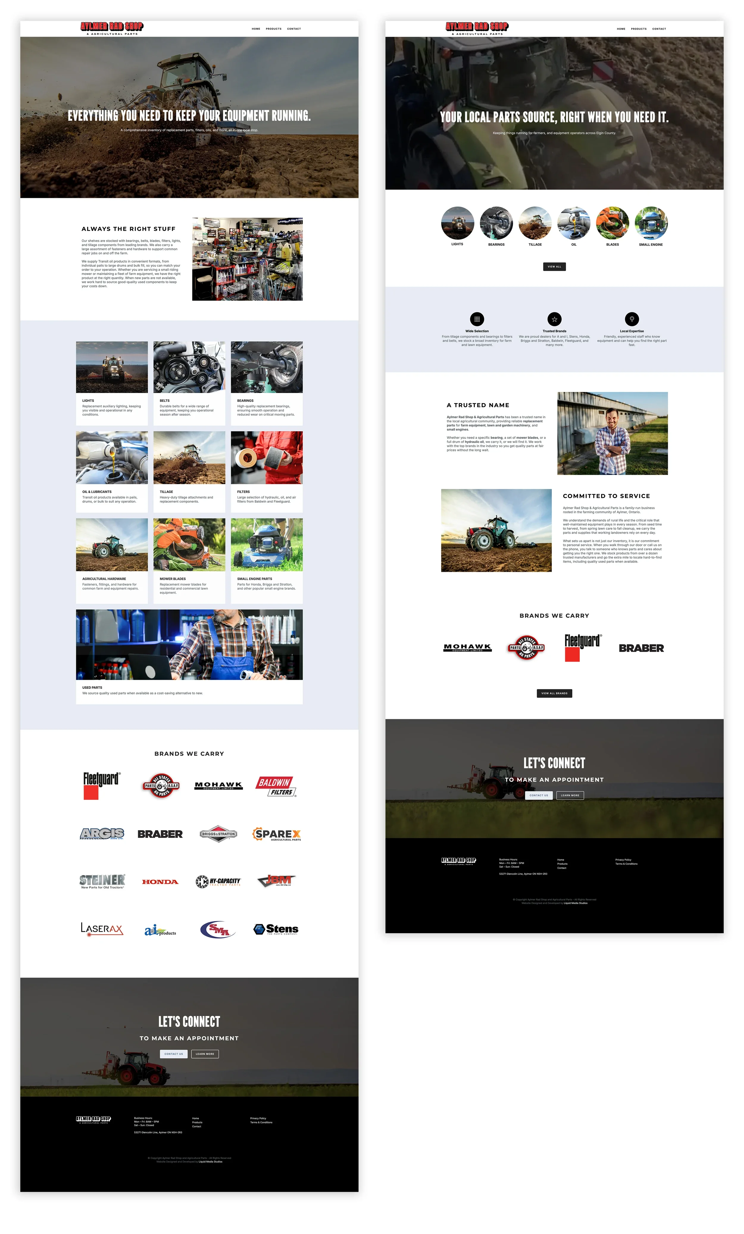
The rebrand kicked off in the form a new website, with crucial importance placed on product clarity and ease of conversion.